Nike Air 180 OG

I feel like the swoosh shape ain't even something ya mad about because of its aesthetics but just cuz it's not like the OG

If the OG looked like 2024

And the 2024 looked like the OG

You'd prob be mad at that principle. Not the actual look of the shoe
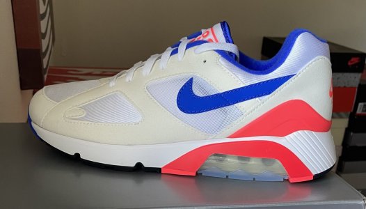
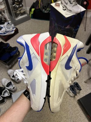
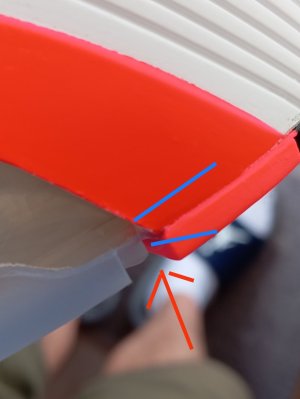
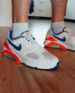
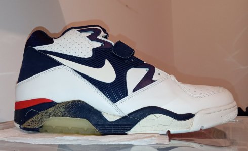
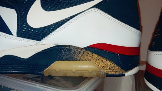
Exactly! Nicely said, thanks, difficult to explain as English (or American) isn't my native tongue!
 
trappedintime trappedintime I think you're talking about the shape of the swoosh itself, where it goes into the curve? I'm talking about the 'stem' of the swoosh that never was or has been the same width all the way. A well, doesn't matter much, it's a MUST HAVE anyways!! 🤩🤩🤩
 
It is kind of weird how nike emphasized that the 2024 retro will be as close as possible to the OG going as far as doing a 3-D scan yet the swoosh is different
 
It is kind of weird how nike emphasized that the 2024 retro will be as close as possible to the OG going as far as doing a 3-D scan yet the swoosh is different
The 85 1’s don’t have the same old swoosh, nor does the Cortez. Nike made a choice for a consistent look of its logo. I don’t think it’s anymore complicated than that. Find me a retro that has the old swoosh.
 
The swoosh was definitely tapered towards the back of the shoe.


IMG_8736.jpeg
 
The 85 1’s don’t have the same old swoosh, nor does the Cortez. Nike made a choice for a consistent look of its logo. I don’t think it’s anymore complicated than that. Find me a retro that has the old swoosh.
Where are you getting this information about Nike reformulating the swoosh on all products? The big bubble air max 1 has basically the same swoosh as the original from 1986… It’s tapered towards the end… I expect the same treatment on this 180.
 
That's the word I was looking for: tapered! It's even tapered on the 2018's and also the retro's before that.
1000090246.jpg
 
Where are you getting this information about Nike reformulating the swoosh on all products? The big bubble air max 1 has basically the same swoosh as the original from 1986… It’s tapered towards the end… I expect the same treatment on this 180.
I thought it was common knowledge the angle of the hook and the thickness of the extension line were modified. Overlay og 85’s vs highs. Or even the Mac Attacks. Go down the line and overlay the retro on the OG. And then compare new models vs an OG swoosh. I think of the OG swoosh as having more of a “cursive” look with the hook which may align with changes to the typeface for the rest of the logo.

What you’re really referring to is not a lack of taper but how much is showing and in this case it’s a minimal difference from the OG that is more consistent with how retro swooshes have appeared across models. And that wasn’t even consistent for the first decade+ it was used and changed in implementation based on the logo typeface at times:

“The Davidson design held steady until a 1976 shift when the font moved to Futura and the lettering was officially dropped fully in 1995. The company switched the warm red to orange, the color of the brand today.”

It's really interesting, and I think you're absolutely right about the angle of the hook. However, I stand by the fact that it's not a lack of taper because the minimal showing of the swoosh. On the model they showed during the last episode of Bring the Heat or whatever it's called it's just not tapered at all. Just compare an OG 180 with the retro they showed last week and you'll see. The image is somewhere in this thread, I'm afraid to show it once again 😬🤣
 
I thought it was common knowledge the angle of the hook and the thickness of the extension line were modified. Overlay og 85’s vs highs. Or even the Mac Attacks. Go down the line and overlay the retro on the OG. And then compare new models vs an OG swoosh. I think of the OG swoosh as having more of a “cursive” look with the hook which may align with changes to the typeface for the rest of the logo.

What you’re really referring to is not a lack of taper but how much is showing and in this case it’s a minimal difference from the OG that is more consistent with how retro swooshes have appeared across models. And that wasn’t even consistent for the first decade+ it was used and changed in implementation based on the logo typeface at times:

“The Davidson design held steady until a 1976 shift when the font moved to Futura and the lettering was officially dropped fully in 1995. The company switched the warm red to orange, the color of the brand today.”

there is no taper at all. It’s straight all the way to the back. I know we’re all looking at the same photos.
 
Burn them.

Don’t forget the air bag will squeak in them eventually.
Problem is the outsole is only glued on to the sides of the airbag. So I ripped the sole off from back to airbag with aceton, cleaned it and glued the whole thing back together with contact cement. They're perfect since 😄
 
Back
Top Bottom